
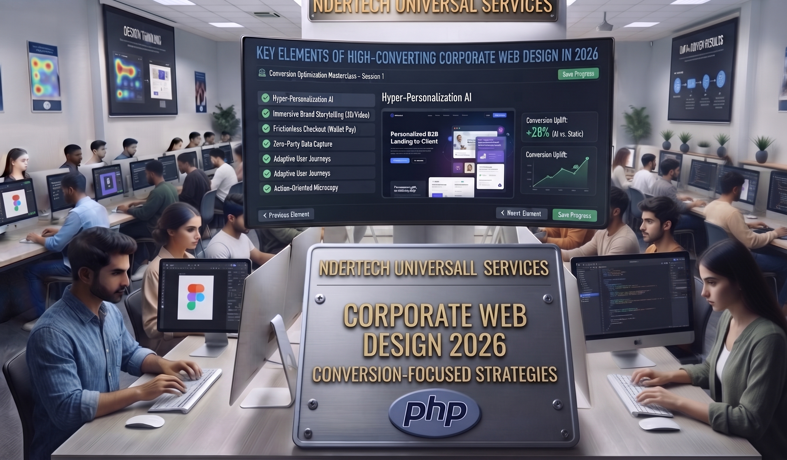
Web design standards evolve rapidly, driven by shifting user expectations, mobile optimization requirements, and advanced browser rendering capabilities. In 2026, building a corporate website requires a delicate, highly strategic balance between visual luxury and ruthless functional efficiency. A website may look visually striking, but if it fails to convert casual visitors into active clients, it falls short of its primary commercial purpose.
1. Crystal-Clear Value Propositions Above the Fold
When a visitor lands on your corporate homepage, they should instantly understand who you are, what you do, and how your solutions benefit them within three seconds. The "above the fold" section—the portion of the web page visible without scrolling—must feature a compelling headline, a supportive subheadline, and a strategic call-to-action (CTA) button.
Cluttered layouts and vague corporate jargon alienate potential clients. Precision engineering and concise, impactful copywriting guide user attention precisely where you want it, reducing bounce rates and maximizing engagement.
2. Frictionless Navigation and User Experience (UX) Architecture
User experience dictates how effortlessly visitors find what they are looking for. Complex navigation menus, hidden contact details, and disorganized page hierarchies frustrate users and drive them straight to competitors. A high-converting corporate website relies on intuitive information architecture:
- Clean sticky navigation headers with direct links to Home, About Us, Services, Portfolio, Blog, and Contact desks.
- Logical dropdown categories that organize extensive service offerings without overwhelming the screen.
- Prominent search functionalities that allow users to query specific articles, projects, or technical tools instantly.
3. Strategic Call-to-Action (CTA) Placement
Every page on your corporate website should serve a distinct conversion goal. Whether you want visitors to schedule a consultation, request an IT audit, or download a technical whitepaper, CTAs must stand out visually. Utilizing contrasting, luxury accent colors—such as professional gold highlights against deep dark surfaces—draws the eye and encourages clicks.
Furthermore, placing secondary CTAs at the bottom of long-form articles or service breakdowns captures high-intent readers who have already educated themselves on your offerings.
4. Mobile Responsiveness and Cross-Browser Consistency
With mobile devices accounting for over half of global web traffic, mobile-first design is mandatory. A high-converting corporate portal must adapt fluidly across smartphones, tablets, and ultra-wide desktop monitors. Touch targets must be appropriately sized, text must remain readable without zooming, and forms must be effortless to complete on smaller screens.
Conclusion
High-converting corporate web design is an intersection of art, psychology, and engineering science. By focusing on crystal-clear messaging, intuitive user flows, strategic CTAs, and flawless mobile responsiveness, enterprises can transform their web portals into powerful, 24/7 revenue-generating machines.